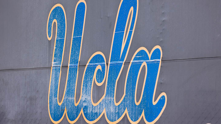
Here's a breakdown of some key logos of UCLA through out the years.
Honorable Mention
The Bruins weren't always the Bruins. In the early years of UCLA's existence our totem was the grizzly bear. Learn more about our transformation into the Bruins, University of Montana and the NCAA here: https://t.co/Nclrl6xEEZ #UCLA100 pic.twitter.com/PrB76o4Wut
— UCLA (@UCLA) May 28, 2019
1964-1995: Classic UCLA Cursive Wordmark

In 1964, UCLA introduced a cursive script logo that became widely popular. This logo remained in use for over 30 years.
• Script: The typeface is a classic italic script, with all letters connected in a flowing, handwritten style.
· Lettering: Each letter is distinct but complements the others. The capital "U" typically features a slightly wider entry stroke compared to the downstroke. The "C" curves gently and connects to the "L" with a flourish. The "L" has a downward stroke with a slight curve at the end. The "A" has a wide base with a narrow top, and the crossbar connects to the right upright near the top.
· Color: The classic version utilizes UCLA's signature colors: powder blue and gold. The letters are typically in gold, outlined or filled with powder blue.
1964-1995: Joe Bruin
This weeks #TBT takes us back through the different eras of Joe Bruin, depicting the famed mascot from 1919 to today’s current design, unveiled in 1996. Which is your favorite? pic.twitter.com/sDpBQDltLM
— UCLA Alumni (@UCLA_Alumni) July 21, 2022
Also in 1964, Joe Bruin, the UCLA mascot, made his first appearance as a secondary logo. This served as a reminder that UCLA was not just a powerhouse in academics, but also in athletics.
Early Joe Bruin (Pre-1996):
• Style: These early depictions often leaned towards a more cartoonish or friendly appearance. Imagine a cute and cuddly teddy bear.
• Details: Think big, friendly eyes, a wide smile, and a somewhat simplified bear face. The proportions might not have been as anatomically correct as later versions.
• Coloring: The classic UCLA colors of powder blue and gold were prominent. The bear's body was usually gold, with blue accents for facial features, ears, and possibly paws.
Modern Joe Bruin (1996-Present):
• Style: The 1996 redesign aimed for a more modern and athletic look. Joe Bruin became more muscular and dynamic.
• Details: The facial features became more defined, with a stronger jawline and a less prominent smile. The overall look aimed to convey a more competitive spirit.
• Coloring: The color scheme remained the same (powder blue and gold), but the application might have shifted slightly. For instance, the gold might be used for highlights or shading to create a more three-dimensional effect.
1972-Present: "B" for Bruins

The simple yet recognizable "B" logo was introduced in 1972 and remains in use today.
"B" for Bruins logo for UCLA:
• Shape: The logo is a simple capital letter "B" in a bold, block font.
• Color Scheme: It utilizes UCLA's official colors: powder blue and gold. The letter "B" is typically filled with powder blue, while the background remains white or transparent.
• Style: Similar to the Joe Bruin logo's modern iteration, the "B" has a clean and modern aesthetic. The block font creates a strong and recognizable symbol. There are no shadows or gradients used, keeping the design flat and versatile.
• Variations: There might be minor variations in terms of the exact shade of blue or the stroke thickness of the "B," but the core design remains consistent.
1996-2003: Modern Joe Bruin
When @UCLA was initially founded as the Southern Branch of the University of California, a scraggly stray dog named Rags served as the unofficial mascot. Find out how the mascots have evolved over the years to become the beloved #Bruins we know today: https://t.co/jbqcsc5x3Z. pic.twitter.com/C9WnXuS8JG
— UCLA Alumni (@UCLA_Alumni) April 26, 2024
The 1990s saw a trend of mascots being redesigned to look more "cartooney" and modern. UCLA's Joe Bruin got this treatment in 1996.
1996-Present: Refined "UCLA" Logo
The UCLA logo through the years 🤩
— FOX College Football (@CFBONFOX) July 20, 2023
Which one is your favorite? ⬇️ pic.twitter.com/eq2q9Xr5E5
Following the trend of other sports teams in the late 1990s and early 2000s, UCLA adopted a more simplified version of their wordmark logo in 1996.
2004-Present: Campus Logo
The current UCLA campus logo, designed by alumnus Keith Bright, was adopted in 2004. It features a simple and modern take on the UCLA lettering with a slight slant for a dynamic feel. The logo comes in both boxed and unboxed versions, with the boxed version being the preferred choice.
